PopUp Dashboard
⚠️ Note
Sample codes are for demonstration purposes only. Before using in production, add proper error handling such as try-catch blocks, null checks, and input validation.
Overview
In this sample we use a Visual Studio 2022 template that is provided by M-Files to create a simple a basic User Interface Extensibility Framework application.
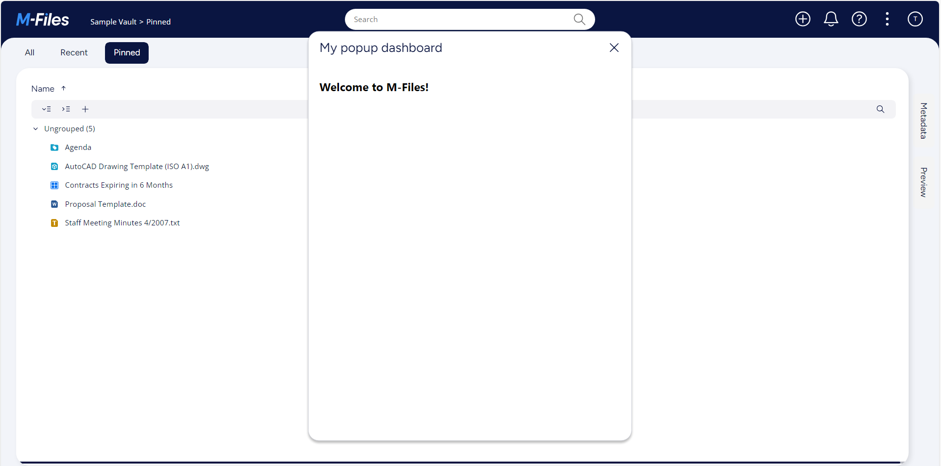
This sample consisting of one ShellUI module which adds one button to main menu and it will opens one dashboard to the popup. Also it shows how accent color option can be retrived and used in our UI extesion applicaton.
Downloading the Template
The UIX templates are part of the M-Files Online Visual Studio template package, which can be downloaded from the Visual Studio Marketplace.
The application structure
The application definition file
In the App folder there is a file named appdef.xml, the application manifest file, containing information such as the publisher details and the current version number. We modified existing manifest file according on our sample application. The application will use version 5 of the client schema (as we are only targeting newer M-Files versions). The application will declare a single Shell UI module (with its code in main.js).
- XML
<?xml version="1.0"?>
<application xmlns:xsi="http://www.w3.org/2001/XMLSchema-instance" xsi:noNamespaceSchemaLocation="http://www.m-files.com/schemas/appdef-client-v5.xsd">
  <guid>83A5DD0A-E386-454E-B5AB-3D52AF13B7C3</guid>
  <name>PopUp Dashboard</name>
  <version>0.1</version>
  <description>A basic application showing how to work with popup dashboards.</description>
  <publisher>M-Files Corporation</publisher>
  <enabled-by-default>true</enabled-by-default>
  <modules>
    <module environment="shellui">
      <file>main.js</file>
    </module>
  </modules>
  <dashboards>
    <dashboard id="MyPopUpDashboard">
      <content>index.html</content>
    </dashboard>
  </dashboards>
</application>
Creating the module
Next we will create a module file to contain our actual application logic. At this point we will just register to be notified of main lifecycle events:
- We will declare a default entry point for the ShellUI module.
- We will react to the OnNewShellUI event and obtain a reference to the shell frame.
- We will react to the shell frame’s onStarted event (as using the shell frame before this point will result in an exception).
- JavaScript
function OnNewShellUI(shellUI) {
  /// <summary>Executed by the UIX when a ShellUI module is started.</summary>
  /// <param name="shellUI" type="MFiles.ShellUI">The shell UI object which was created.</param>

  // This is the start point of a ShellUI module.

  // Register to be notified when a new shell frame (MFiles.Event.NewShellFrame) is created.
  shellUI.Events.Register(MFiles.Event.NewShellFrame, handleNewShellFrame);
}

function handleNewShellFrame(shellFrame) {
  // Add tab to right pane, when the shell frame is started.
  shellFrame.Events.Register(MFiles.Event.Started, onStarted);

  // NOTE: to be on the safe side, handle the callback in "async" function and await all the
  // return values, because when the postMessage API is used, all return values will be async.
  async function onStarted() {}
}
Creating a button in the main menu
Adding a button into the main menu involves two steps:
- Creating a new ICommand using CreateCustomCommand.
- Adding the command into the task area using AddCustomCommandToMenu.
- JavaScript
function OnNewShellUI(shellUI) {
  /// <summary>Executed by the UIX when a ShellUI module is started.</summary>
  /// <param name="shellUI" type="MFiles.ShellUI">The shell UI object which was created.</param>

  // This is the start point of a ShellUI module.

  // Register to be notified when a new shell frame (MFiles.Event.NewShellFrame) is created.
  shellUI.Events.Register(MFiles.Event.NewShellFrame, handleNewShellFrame);
}

function handleNewShellFrame(shellFrame) {
  // Add tab to right pane, when the shell frame is started.
  shellFrame.Events.Register(MFiles.Event.Started, onStarted);

  // NOTE: to be on the safe side, handle the callback in "async" function and await all the
  // return values, because when the postMessage API is used, all return values will be async.
  async function onStarted() {
    const myCommand = await shellFrame.Commands.CreateCustomCommand(
      'Show my popup dashboard',
    );
    await shellFrame.Commands.AddCustomCommandToMenu(
      myCommand,
      MFiles.MenuLocation.MenuLocation_TopPaneMenu,
      1,
    );
  }
}
Logging into the M-Files vault should now show a button in the main menu (three dot menu near user icon) with the text Show my popup dashboard:

Creating the dashboard
Next we will create a dashboard file that will be shown in the popup. It involves two steps:
- Modifying existing index.html file which will load styles and dashboard handler.
- Modifying existing dashboard.js file which will handle the dashboard.
- HTML
<!doctype html>
<html lang="en">
  <head>
    <title>My Popup Dashboard</title>
    <script src="mfiles.extensibility.protocol.js"></script>

    <!-- Load styles and dashboard handler js file -->
    <link href="style.css" rel="stylesheet" />
    <script src="dashboard.js"></script>
  </head>
  <body>
    <div id="content">
      <h2>Welcome to M-Files!</h2>
    </div>
  </body>
</html>
Create dashboard handler using OnNewDashboard event.
- JavaScript
async function OnNewDashboard(dashboard) {}
Show the dashboard on clicking button
Showing dashboard while clicking a command clicked involves three steps:
- Register to be notified of the CustomCommand event.
- Ensure that the command that was clicked was the one we want to handle.
- Call ShowPopupDashboard from shellframe instance.
We will have three parameters for this ShowPopupDashboard
- Id of the dashboard which is mentioned in the appdef.xml. Ex. MyPopUpDashboard
- data - Custom data needs to be passed to dashboard.
- title - The title of the popup dashboard.
- JavaScript
function OnNewShellUI(shellUI) {
  /// <summary>Executed by the UIX when a ShellUI module is started.</summary>
  /// <param name="shellUI" type="MFiles.ShellUI">The shell UI object which was created.</param>

  // This is the start point of a ShellUI module.

  // Register to be notified when a new shell frame (MFiles.Event.NewShellFrame) is created.
  shellUI.Events.Register(MFiles.Event.NewShellFrame, handleNewShellFrame);
}

function handleNewShellFrame(shellFrame) {
  // Add tab to right pane, when the shell frame is started.
  shellFrame.Events.Register(MFiles.Event.Started, onStarted);

  // NOTE: to be on the safe side, handle the callback in "async" function and await all the
  // return values, because when the postMessage API is used, all return values will be async.
  async function onStarted() {
    const myCommand = await shellFrame.Commands.CreateCustomCommand(
      'Show my popup dashboard',
    );
    await shellFrame.Commands.AddCustomCommandToMenu(
      myCommand,
      MFiles.MenuLocation.MenuLocation_TopPaneMenu,
      1,
    );
    await shellFrame.Commands.Events.Register(
      MFiles.Event.CustomCommand,
      (command) => {
        // Execute only our custom command.
        if (command === myCommand) {
          shellFrame.ShowPopupDashboard(
            'MyPopUpDashboard',
            {},
            'My popup dashboard',
          );
        }
      },
    );
  }
}

Using accent color
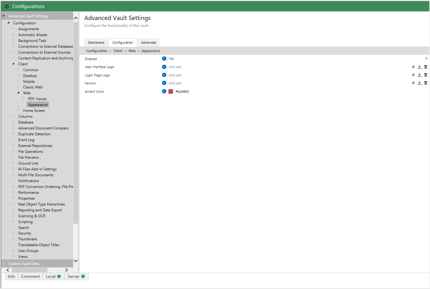
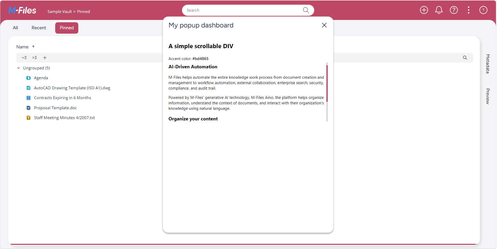
In the M-files Admin you can specify the accent color that you want to use in M-Files Web. The accent color has an effect, for example, on the header, the scrollbars, and some of the icons.
You can set the accent color value in Configurations -> Advanced Value Settings -> Configuration -> Client -> Web -> Appearance

We can retrive the accent color value and use it in our custom extension application.
- JavaScript
async function OnNewDashboard(dashboard) {
  const accentColor = await MFiles.GetAccentColor();
  document
    .querySelector(':root')
    .style.setProperty('--scrollbar-thumb-color', accentColor);
  document.getElementById('accentColorValue').textContent = accentColor;
}
- HTML
<!doctype html>
<html lang="en">
  <head>
    <title>My Popup Dashboard</title>
    <script src="mfiles.extensibility.protocol.js"></script>

    <!-- Load styles and dashboard handler js file -->
    <link href="style.css" rel="stylesheet" />
    <script src="dashboard.js"></script>
  </head>
  <body>
    <div id="content">
      <h2>A simple scrollable DIV</h2>
      <div>Accent color: <span id="accentColorValue"></span></div>
      <div id="scrollableDIV">
        <h3>AI-Driven Automation</h3>
        <p>
          M-Files helps automate the entire knowledge work process from document
          creation and management to workflow automation, external
          collaboration, enterprise search, security, compliance, and audit
          trail.
        </p>
        <p>
          Powered by M-Files' generative AI technology, M-Files Aino, the
          platform helps organize information, understand the context of
          documents, and interact with their organization's knowledge using
          natural language.
        </p>

        <h3>Organize your content</h3>
        <p>
          M-Files adapts to the document flow and content of any organization.
          Classifying documents and extracting their meaning optimizes knowledge
          worker productivity by automating routines and ensuring information
          can be easily found and used in the proper business context.
        </p>
      </div>
    </div>
  </body>
</html>
- CSS
html,
body {
  font-family: Lato, 'Segoe UI', Sans-Serif;
  margin: 0;
  background: #fff;
  height: 100%;
  font-size: 14px;
  padding: 0 10px;
}

:root {
  --scrollbar-thumb-color: black;
}

div {
  padding: 4px 0;
}

span {
  font-weight: 500;
}

#scrollableDIV {
  height: 200px;
  overflow-y: scroll;
  scrollbar-color: var(--scrollbar-thumb-color) lightgray;
}
Now we can see scrollbar has same color as the accent color that we have set on M-Files Admin.
