UI Components
This page describes the various UI components used by M-Files clients, their function, and common styling parameters.
Menu

Located in the top pane, Menu provides direct access to views and other main functions. From menu you can access All, Recent, Assigned, Checked Out and Pinned.
Style and layout parameters:
- Text-color (inactive): #0A1541
- Text-color (active): #ffffff
- Highlight-color: #0A1541
- Font-size: 16px
Lists
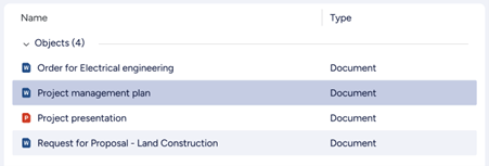
A List is the typical method for displaying a collection of multiple items such as views or objects. Lists are mostly located within the Listing Area.
Style and layout parameters:
- Row-height: 36px
- Font-color (heading): # 0A1541
- Font-size (heading): 14px
- Padding-left (heading): 24px:
- Font-color (listing): # 0A1541
- Font-size (listing): 14px
- Padding-left (listing): 24px:
- Icon-size: 16px
List grouping header
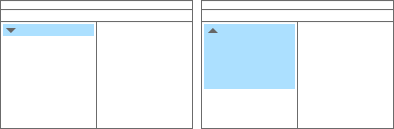
A List Grouping can be used to organize listed objects, grouping them by object type or a specific metadata property. The grouping appears as a header component with textual title and expanding/collapsing control on right side.
Style and layout parameters:
- Background-color: #ffffff
- Font-color: #0A1541
- Font-size: 14px
Search
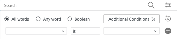
Search function in M-Files is hosted by Search bar, and enhanced by Search filters and Advanced search options.
Search bar

In top pane, a Search Bar with search field, search button and access to Advances search options can be found.
Search filter
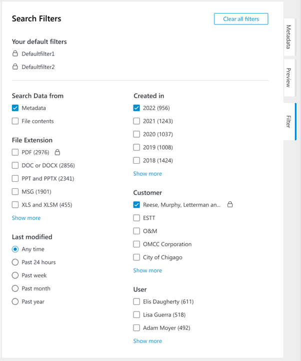
Search Filters tab will be activated when search field is focused. User will find options to enhance the search function before or after search is performed.
Advanced search options
Advanced search options will be toggled on or off by clicking on the right most icon of the Search bar.
Dialogs
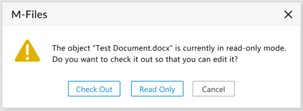
Example of a common Dialog in M-Files that consists a title, an icon, a dialog message and a button group.
Menus
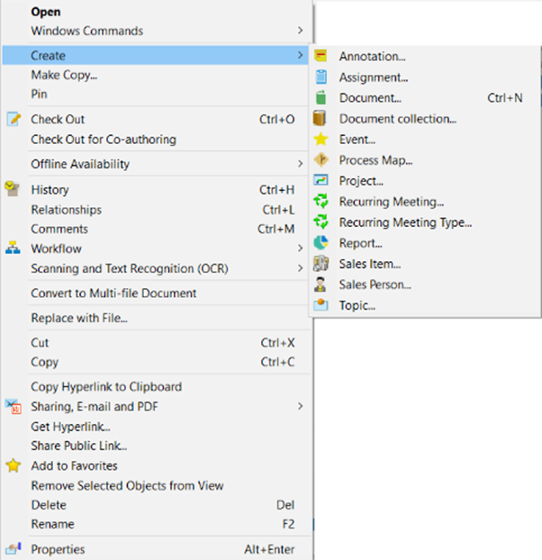
Here is an example of a context menu activated by right-click on an object which provides corresponding functions.
Context menu items can be added using the User Interface Extensibility Framework.
Metadata card
Metadata Card is dedicated for displaying and editing Metadata for object classification and basic properties of selected object(s). User also can access object related functions from Function Ribbon.
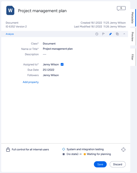
Function Ribbon

By using function buttons on the ribbon, user are able to Follow and Pin objects. With the M-Files release, we also introduced the Analyze button. Clicking this button will execute any registered Intelligence Services for the document, and show any additional metadata suggestions on the metadata card.
Buttons
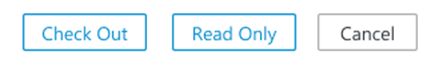

Buttons are used to move to the next step, confirm or cancel actions.